Contents
There isn’t just one ideal screen size for responsive web design but there are certainly different screen sizes for responsive design that work well.
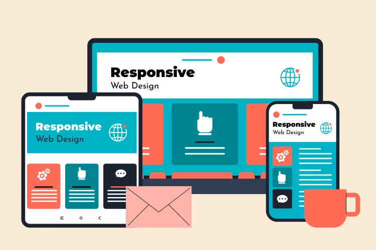
Websites ought to adjust quickly and responsively across all screen resolutions across all platforms and browsers. Responsive and suited for mobile.
Responsive Screen Sizes: Prioritize designing for your audience by adopting the most common screen sizes for responsive design ranging from 360×640 through 1920×1080.
- Designs ranging from 1280×720 to 1920×1080 for desktop monitors
- Mobile display design ranging from 360×640 to 414×896
- Tablet display design ranging from 601×962 to 1280×800
- Verify Google Analytics and adjust for the most popular resolution sizes of your target audience.
- Do not design for one display size or screen resolution. Visitors differ in their screen widths and browser window states.
- The design ought to be quick and responsive. Make use of a responsive or liquid layout that adjusts to the size of the user’s window at that moment.
- Keep an eye on Google Search Console’s usability and mobile friendliness notifications.
Your website should function and look excellent across a range of screen sizes. Use a responsive website template as it is the generally acknowledged best practice.
Your website won’t rank as highly in Google Search if you don’t follow Google’s specific recommendations.
To keep in mind:
Use of CSS media queries, adaptable grid-based layouts, consideration of various aspect ratios and screen resolutions, and testing the website across a range of devices are all important considerations when it comes to responsive design.
To optimize a page layout for a certain screen size, take the following pointers into account:
Web page initial visibility: Can people view all important content without having to scroll down if it’s displayed above the fold? There is a trade-off between the quantity of information presented for each item and the number of items displayed.
Web Page Readability: Considering the width of each column, how simple is it to read the text within them?
Web page aesthetics: How well-designed is your page when the elements are positioned and scaled to fit this particular screen size? Are captions placed directly next to the photographs, and is there enough space between the images and the following text? Are all the elements lined up correctly?
Top 10 most common screen sizes and resolutions
| 1 | 1920×1080 | 8.83% |
| 2 | 360×800 | 7.43% |
| 3 | 1366×768 | 6.09% |
| 4 | 1280×720 | 6.07% |
| 5 | 1536×864 | 4.02% |
| 6 | 390×844 | 3.89% |
| 7 | 412×915 | 3.41% |
| 8 | 393×873 | 3.03% |
| 9 | 360×780 | 2.72% |
| 10 | 360×640 | 2.53% |
Google recommends Responsive Web Design because it’s the easiest design pattern to implement and maintain
Google Developer Guides
Many people use the internet on portable devices (tablets and smartphones), and responsive website design (RWD) has become apparent as a very plausible answer (though experts continue to argue it) to screen size issues.
Instead of utilizing fixed-width websites, this technique makes use of CSS Media Queries to produce a website that adjusts its size to fit the various viewports that people use on smaller displays and portable devices.
You can therefore provide the best experience possible to visitors to your website, regardless of the device they may be using to see it.
Google prefers mobile-friendly sites
Google controls the flow of online business, and they just made it clear that if you want to rank well for competitive keywords in Google, your design must provide a positive user experience across a variety of devices.
Google uses two different crawlers for crawling websites: a mobile crawler and a desktop crawler. Each crawler type simulates a user visiting your page with a device of that type. Google uses one crawler type (mobile or desktop) as the primary crawler for your site. All pages on your site that are crawled by Google are crawled using the primary crawler. The primary crawler for all new websites is the mobile crawler. In addition, Google recrawls a few pages on your site with the other crawler type (mobile or desktop). This is called the secondary crawl, and is done to see how well your site works with the other device type.
Google Webmaster Guidelines
Since April 21, 2015, a website’s mobile friendliness has had an impact on its ranking performance across a range of devices globally.
Making websites for small businesses will let you know that they are interested in search engine optimization and that they want a website that will rank highly in Google’s organic listings.
Good website user experience (UX), as measured by Google, is now a major component of SEO, at least for mobile users.
With mobile searches now exceeding desktop searches, it’s important that your site be mobile-friendly. Googlebot now uses a mobile crawler as the default crawler for websites.
Google Webmaster Guidelines
One of the signals for a Google page experience is mobile friendliness.
Most Common Mobile Screen Resolution Sizes Worldwide
- 360×800 – 11.62%
- 390×844 – 6.41%
- 414×896 – 5.65%
- 412×915 – 5.47%
- 393×873 – 4.77%
- 360×780 – 4.26%
- 360×640 – 4.07%
Image by Freepik